
This article was originally published in Beverage Industry on May 6, 2019.
In the face of rising competition in consumer packaged goods (CPGs), beverage-makers are designing or redesigning their packaging to stand out on store shelves. An upbeat color palette; easy-to-read, elegant typography; contrasting colors that pop; and playful graphics that emphasize branding are among the ways modern designers are bringing these concepts to life.
Although trends go through waves, connecting with consumers and knowing what they are looking for in a product is synonymous with success, says Alex Kidd, creative design manager for Avery Dennison/The Concept Lab, Mentor, Ohio.
“Knowing how to connect with them is different across various demographics and age ranges,” Kidd says. “Knowing what they are looking for in a product is key. Then, how do you convey your brand though your packaging? How do you tell your story of your brand?”
Although art-inspired labels are populating the beverage market, different kinds of art are appearing on non-alcohol and alcohol labels. “Brands are not just throwing a painting on a label, but are treating the label as a canvas for the brand,” Kidd explains. “In overall beverage packaging, brands are being more expressive with their design than ever before.
“There are still traditional designs out there, but brands are taking a leap to connect with consumers more dramatically than ever,” he continues. “There is a lot of well-designed packaging, but only a few truly well executed packs rise to the top.”
Jon Nunziato, founder and chief executive officer of White Plains, N.Y.-based Little Big Brands, is seeing more personality making its way back into package design. “The days of modern, sterile brands are waning,” he explains. “Brands that incorporate more imagery, character development and even borrowing from fashion are exploding. This feels like a response to consumers who are supporting customization and brands that ‘get them.’ It’s a shift from a ‘big brand’ mindset of trying to capture every consumer, to a more targeted approach and desire to build a loyal group of brand enthusiasts.”
A fresh take
Experts note that many companies, even those that have been in business for decades, are refreshing their brand as a way to reflect nostalgia while also appealing to younger consumers.
In business for more than 100 years, Kansas City-based Shatto Milk Co. joined forces with Chicago-based Berlin Packaging to add fresh “flavor” to its new milk flavorizer product. After seeing several packaging solutions, the company opted for a 76-by-76-inch specialty tin with friction fit lids and silkscreened decoration with the outline of a colorful milk carton, which captured the simplicity of the Shatto Milk brand and nostalgic feelings of childhood, the company says.
The previously limited-edition shelf-stable flavorizers will be available nationwide later this year in five flavors: Blueberry, Cinnamon Roll, Orange Dream, Strawberry and Vanilla.
“Many folks that have lived in Kansas City and enjoyed our products have found themselves living in other areas where Shatto is not available,” said Matt Shatto, founder of Shatto Home Delivery, in a statement. “This provides us a way to ship a bit of Shatto to them in a shelf-stable way for them to enjoy away from Kansas City. Overall, the project would not have been possible without the guidance of Tim, our representative from Berlin Packaging, who helped us all along the way. It has been a terrific process that has resulted in an outstanding product.”
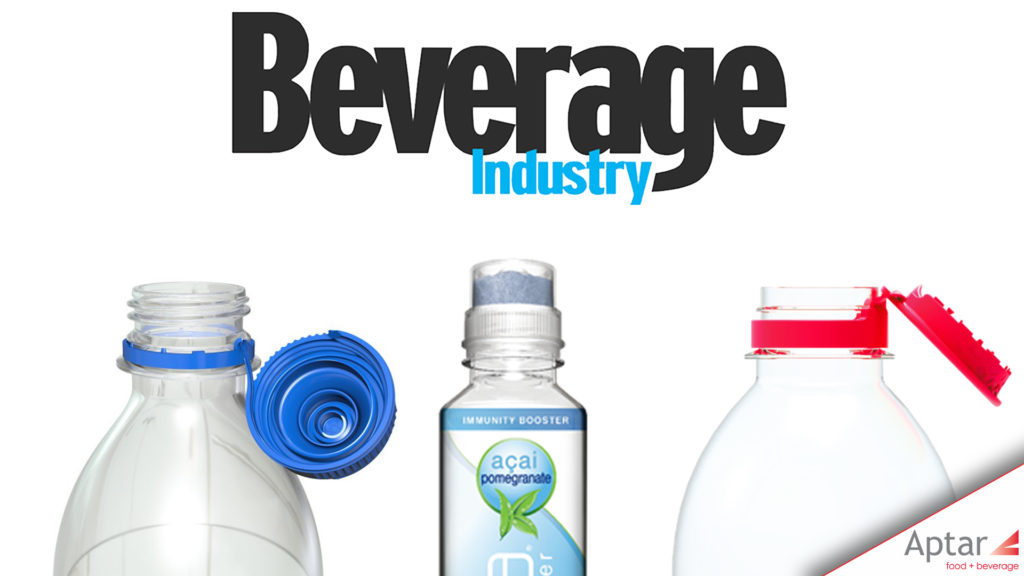
As trends change and evolve, CPGs are calling upon their design partners to not only deliver clean lines, clarity and simplicity, but to develop options and designs that are recyclable, reusable and enable consumers to pursue healthier habits, says Terry Keener, director of regional market development for Beverage North America at Crystal Lake, Ill.-based Aptar.
Aptar has developed a “Stay-With” technology where a tamper-evident band and cap remain attached to the bottle throughout its lifecycle, improving closure recyclability, Keener says. In addition, Aptar offers the Karma Push Cap, a delivery system housed in the cap that infuses powder or liquid ingredients into almost any substance.
“The Karma Push Cap is another example of simplicity and sustainability, as it is made of recyclable and FDA-compliant material,” Keener says. “It answers consumer demand for freshness … and facilitates portion control and the ability to separate ingredients that are not otherwise shelf stable. As consumers continue to pursue healthier habits, providing designs that enhance freshness is not only becoming more valued, but also a requirement in many applications”
Little Big Brands’ Nunziato affirms that consumers are searching for brands with a higher purpose and environmental stewardship. When it comes to innovation, he praises Florida’s Saltwater Brewery’s innovation in creating six-pack rings that biodegrade and feed wildlife, Carlsberg beer for gluing its cans together and abandoning the plastic ring altogether, and the “exciting work” of Skipping Rocks Labs, creators of Ooho bubble, a seaweed-based water “bottle” that consumers can eat.
Although innovation in materials and capabilities tends to move slowly, Nunziato says he and his team encountered “one of the coolest innovations” from a new brand called Szent. “They incorporate a scent ring around the cap of the bottle, so you get the sensation of drinking flavored water, when in actuality it’s just plain water,” he says. “… That just stopped us.”
Experts note that creating the right packaging design involves significant collaboration across all elements of brand strategy, design and execution, materials and finishes.
When Glasgow, Ky.-based Barren River Distilling Co. needed assistance bringing its American whiskey label to life, the company turned to Glasgow, Scotland-based Thirst and the Avery Dennison Concept Lab.
“It all started with a typographic collaboration, working with our friend Craig Black who is an amazing lettering artist,” Thirst Senior Design Eamon Cameron says. “He developed a beautiful typographic style referencing the old American West. We then created a branding suite to compliment the label and weaved river flown filigree around the typography, which influenced the overall shape of the label.”
Cameron adds that the Concept Lab was integral to the realization of the project. In multiple video calls, the two companies hashed out potential finishes on various substrates. They experimented with physical samples and discussed the pros and cons of materials to come up with a finished package that speaks to the brand’s visual identity.
“In beverage, you see a lot of different finishing techniques, especially in the wine and spirits categories,” Kidd says. “There are so many labels that have a lot of special finishing techniques applied to them — foil, varnish and embossments. The brands that use these techniques in a very considered, thoughtful manner stand out.
“From a high level, every package is fighting for attention against the competition,” he continues. “It doesn’t always have to ‘shout,’ and can be done in a minimal manner.”
For some non-alcohol brands, calling out the movement to reduce sugar consumption on their packages also is on trend. That was one of the goals of Bakersfield, Calif.-based Bolthouse Farms’ “B” line of B Strong protein shakes and B Balanced smoothies, Little Big Brands’ Nunziato says.
“For the ‘B’ line, which is all about functional, lower sugar products, we created a simplified design to their base business,” he says. “The label was flooded white to create shelf presence and signal the simplicity of the offering. We moved away from the contrived food group to showing simple, natural, real food.
“The design itself creates a strong brand block across the line in a very crowded category,” he adds.
Personalization equals differentiation
Design companies also are embracing digital enhancements as a means of providing personalization and creating limited-edition labels that will resonate with consumers, according to Jennifer Hyland, a marketing professional for food and beverage at Multi-Color Corp.
Based in Cwmbran, South Wales, Hyland helped the California-based Echo Falls wine roll out “everyday” celebration labels across 43 designs in a 50 sequential repeat sequence across the brand’s Top 4 variants: White Zinfandel, Merlot, Pinot Grigio and Chardonnay.
“The initial concepts highlighting various special celebrations to add personalization for the consumer i.e., ‘Occasions’ was born,” Hyland says. “Since launching in the United Kingdom in 2002, Echo Falls has been a huge success story and is currently the third largest wine brand in the U.K. Echo Falls Wine has 10 varieties … and also introduced a Fruit Fusion range as well as a vodka.”
Hyland explains that the 50 unique messages, including “Thirsty Thursdays,” “Bride Tribe,” “40 is the New 30” and “Fri-Yay,” can be added for new/ holiday periods during the year; thereby refreshing the brands periodically.
“These designs were not randomly generated patterns that some companies/press technologies used, but individual designs created from the Accolade packaging team and our design company, Brand Fuel,” Hyland says. “The designs were collated and stepped through the Prinect DFE and output was through our new digital Hybrid press (Gallus Labelfire). This press enables MCC to produce multiple unique labels using variable data technology, differing varnish effects (matte, gloss and tactility in one pass) rather than the standard one label design as used previously on conventional presses.”
Because packaging is an extension of the brand, storytelling, sustainability, finishing techniques and customizable labels are among the ways of connecting consumers with the brand, according to the Control Labs’ Kidd and Little Big Brands’ Nunziato.
“The design elements including color, form and shape and the package must get the consumer’s attention amongst the competition,” Kidd says. “The material chosen is crucial.”
Nunziato adds: “The world doesn’t need more of the same. Be unique. Find your niche, own it, and work with people smarter than you to make it a reality.” BI
To learn more about our beverage solutions, visit our website, or contact us.
